
Illustration inspired by "Siddhārtha Gautama's Life" after i read it. It is a book about the life story of Buddha and the teaching of Buddhism.....enlightening me when i feel lost & helpless...
15 years ago

Illustration inspired by "Siddhārtha Gautama's Life" after i read it. It is a book about the life story of Buddha and the teaching of Buddhism.....enlightening me when i feel lost & helpless...

A photo i took on my way up a highland in Taiwan
6 years ago, it came across my mind if i had walk a wrong path....But i couldn't take away the passion that was burning in my soul. For that, i choose a road not taken by many and i've never look back....
Two roads diverged in a yellow wood,
And sorry I could not travel both
And be one traveler, long I stood
And looked down one as far as I could
To where it bent in the undergrowth;
Then took the other, as just as fair,
And having perhaps the better claim,
Because it was grassy and wanted wear;
Though as for that, the passing there
Had worn them really about the same,
And both that morning equally lay
In leaves no step had trodden black.
Oh, I kept the first for another day!
Yet knowing how way leads on to way,
I doubted if I should ever come back.
I shall be telling this with a sigh
Somewhere ages and ages hence:
Two roads diverged in a wood, and I—
I took the one less traveled by,
And that has made all the difference.
– Robert Frost (1874-1963)
After watching "The Ballad of Sexual Dependency" by Nan Goldin, i cried....
Much affected by her life experiences, i started to sympathize people on the edge, the outcast. Burning their life for something they believe in, living life to the fullest. Maybe because in the 70s life was chaotic; drugs, sex and violence....


 "The Ballad of Sexual Dependency" (1986) explores relationships and includes revealing images such as Self-Portrait with Brian Having Sex, Nan and Brian in Bed and Nan One Month after Being Battered. It also featured Cookie Mueller, Goldin's good friend who, with her husband Vittorio, died of AIDS in 1989. A series of photographic documentary were shown, they featured Nan Goldin's family, friends and loved ones and her life in the 70s & 80s, one of drugs, sex, violence and lots of gays & lesbians. Many of Goldin's subjects in The Ballad were dead either due to AIDS or drug overdoses. Her works is most often presented in the form of a slideshow and these snapshot aesthetic images, usually made with available light, depict drug use, violent, aggressive couples and autobiographical moments.
 Nan Goldin, Self-Portrait
*Born on September 12, 1953, in Washington, D.C, Nan Goldin is an example of an artist who works at the most intimate level: her life is her work and her work, her life. She is the impassioned historian of love in the age of fluid sexuality, glamour, beauty,violence, death. intoxitacion, and masquerade. An uncanny attention and attraction to the drama and the commonplace of life structure her photographs. It is nearly impossible to discuss Goldin's photographs without referring to their subjects by name, as though the people pictured were one's own family and friends. It is this intimate and raw style for which Goldin has become internationally renowned. Her "snapshot"- esque images of her friends – drag queens, drug addicts, lovers and family – are intense, searing portraits that, together, make a document of Goldin's life. Goldin herself has commented on her photographic style and philosophy, saying, "My work originally came from the snapshot aesthetic . . . Snapshots are taken out of love and to remember people, places, and shared times. They're about creating a history by recording a history." Her work continues to evolve with her life. Of this she writes, "My work changes as I change. I feel an artist's work has to change, otherwise you become a replication of yourself." With Goldin's close, immediate style and stunningly beautiful images, there is no threat of her becoming a replication.*
* taken from fabien fryns fine art website

This Austrian graphic designer is one of my favourite designer. His works surprises and provokes you to think. He took a year off work to toured the world talking about graphic design and the importance of content over style. In 2001, Stefan Sagmeister published the book "Made you look" which contains all of his work to date.
The Famous: Lou Reed CD Booklet by Stefan Sagmeister
Sagmeister on a self-promotional poster : Part 1
(featuring himself in his brief)
Sagmeister on a self-promotional poster: Part 2
(featuring himself after eating up all the junk food shown, putting on weight)

A poster that Sagmeister had done for Adobe Design Annual Awards (instead of the usual use of computer / photoshop effect, he and his colleague manually created this picture by aligning paper cups to form the trophy. He then took a top-shot picture of his colleague filling up the trophy with different shades of coffee to create the image that you see above. Everything is done manually. How incredible is that!)
Most of his works are very impactful, usually of self-experimental stuffs. One example is the self-promotional poster he created for himself. It is shocking to me that he took a pen-knife and craved words all over his naked body, inspired by his "Lou Reed" CD booklet that he is best known for. A lot of his famous projects are handmade, i like the fact that it is different, that he uses a different approach at things; seeking a human touch and haptic, going away from this cold world.....and away from all the "computer" stuffs.
" There is just too much fluff: well-produced, tongue-in-cheek, pretty fluff. Nothing that moves you, nothing to think about..."
I was nearly in tears when watching this video...The Wind by Chel White, he cleverly makes use of the background music with fascinating visual to provoke the souls of the viewers.
Set to a poem by Antonio Machado and narrated by Alec Baldwin, visual effects master Chel White uses time lapse photography to simultaneously display the majesty of nature and the destruction of humanity'€™s footprint. This hauntingly beautiful film shows what we stand to lose if we continue to put the environment second to progress, but also shows that it is possible to put technological progress hand in hand with environmental preservation.
On a whole, i watched this video about 8 times, and every time i watch it, it stirred up my emotions. Very depressed after watching..... Incredibly done up, impactful visuals fixed perfectly with the song and the poem. Wonderful video by Chel White!
The Wind,
One Brilliant Day
by Antonio Machado
The wind, one brilliant day, called to my soul with an odor of jasmine.
"In return for the odor of my jasmine, I'd like all the odor of your roses."
"I have no roses; all the flowers in my garden are dead."
"Well then, I'll take the withered petals and the yellow leaves and the waters of the fountain."
the wind left. And I wept. And I said to myself: "What have you done with the garden that was entrusted to you?"
for a full set of S.O.S Live Earth campaign click here


A Chinese design-based book i bought in Taipei诚品 Bookstore; Creative Asia by Sean Yap, a writer from Singapore living in Shanghai. This book take us on a closer look at Design in Asia, featuring top designers from Thailand, Singapore and Hong Kong. It analyses the different characteristic and cultural influence of the designs from these 3 places.
From Singapore: PhunkStudio, Stikfas, Air Division and Ministry of Design (MOD).
From Thailand: Pawinee Santisiri, Crafactor, Greyhound and Osisu.
From Hong Kong: G.O.D, Chiu Kwong-Chiu and Edge Design.
Perhaps because the Author is a Singaporean, i feel that he tends to be a bit subjective when it comes to Singapore. His perspective on Singapore design seems to be on the negative side as to compare with Thailand or Hong Kong; which on my point of view not very true. Hence, i hope readers will be more objective when they are reading the book.


The Legendary VSC GradBook
A MUST in all TP's Design GradShow
Recently i was at the opening of my juniors' GradShow at Temasek Polytechnic Convention Hall. Although the location was a bit far, it was worth the travelling! Was surprised with the standards this year, especially the photography students. They are very experimental, the only minus is that they lack personal identity.....Perhaps that's what happen when you study together, you get affected by your peers' works. I especially like the works of Clarence Aw, they are full of emotions; the textures and depth that he created for his photoshoot are well done.
Clarence Aw, VSC graduate
Homeless, Unseen Japan
Story of a Girl (Product photography)
As for the graphic & advertising students, they were not as strong as the photography ones. It is surprising to see more students taking up graphic than advertising. I remember 1 or 2 years back the whole batch was into advertising. But similarly with past years' students, more than half of the graphic design students choose to specialise in illustration. Which makes those NOT doing illustrations stands out more....but only if they are good with their design (which is not the case here).... Sarah Tan's design has the most consistency and personal identity of the graphic batch. Guess she enjoy reading idN alot, if not, her illustration style wouldn't be so much similar to those featured in the magazine.


 Another worth mentioning is Joie Cheo, this petite guy's pretty good in layout. He stood out from the rest in the graphic design batch because he didn't use any illustrations as the rest did. His was a purely graphic work, layout, grids and so on. I particularly like his editorial design, it was something different, very UK. Unfortunately, his presentation is quite bad, i remembered seeing his mounted work nearly dropping off. Not very tidy hands you got there, Bro....


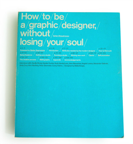

How to be a graphic designer, without losing your soul, a book by Adrian Shaughnessy with Foreword by my favourite designer, Stefan Sagimeister. I bought this book from Basheer and find it very inspiring for designers. In it, it teaches us on the attributes a designer should plus it also showcases interviews with famous designers around the world (eg. Neville Brody, Andy Cruz, Peter Stemmler, Rudy VanderLans, John Warwicker)
This little cyan-coloured book brought lots of inspirations to me, with it i learnt to please clients and to self-satisfy as a designer. Hence i hope you guys will enjoy reading it too....
Contents of the book are as stated below:
I was honored to attend a private exhibition by one of my RMIT lecturers, Alexandar Zubryn. It was held at the Chapman&Bailey (350 Johnson Street Melbourne, Australia).
I was fascinated by the six 2.4metres tall oil painting that he did. As shown, they were close-up visuals of the texture of trees on the same background. On a closer look, they seem to have capture my soul, I could vividly see the chaos within the peace of the environment. Within the realistic texture of the tree trunk, i could see images of humans, old and young. After a short chat with Alex, he explained that he wanted his paintings to create an illusion of chaos and order which provokes the viewer to think about the construction of urban and nature.


Below is the essay i wrote for my Design BA, hopefully my article will shed some lights on designers who are lost....
Many times the question of, “Design for self-expression or for my clients’ contentment?” keeps popping out in my mind. What is Design? Is it merely a “bread and butter” job or did it meant more? I truly believe that a designer’s duties aren’t just about problem-solving, there’s a lot more than what it seem in this communication design industry.
Like all designers, I started fresh in this trade with a passion in creativity. But somehow having to deal with clients’ unreasonable demands tore me out. There are times when I feel lost and wonder, “Does anyone appreciate my design?” During some days, when I have to deal with tones of deadlines and a rude client called asking me to change a design to something totally ridiculous. I always feel like telling the client off, but the fact that he or she is my paymaster holds me back. It had become extremely difficult trying to strike a balance between my self-satisfaction in design and still make money.
The implication of the word “professional” as we use it is indicative of the problem here. How often do we hear, “Act like a professional” or, “I’m a professional, I can handle it?” Being a professional means to put aside one’s personal reactions regardless of the situation and to carry on. Prostitutes, practitioners of the so-called oldest profession, must maintain an extreme of cool objectivity about this most intimate of human activities, highly disciplining their personal responses to deliver an impartial and consistent product to their clients. Is it really what we as a designer is suppose to do? What about all designers’ desire for self-expression? Or is problem-solving what true “professionals” do?
This takes us to the heart of one of the most important debates in design over recent years. On the one hand, we have those who believe that graphic design is a problem-solving business tool and that designers should suppress their desire for personal expression to ensure maximizing the effectiveness of the content. While on the other hand, we have those who believe that although design undoubtedly has a problem-solving function, it also has a cultural and aesthetic dimension, and its effectiveness is enhanced, and not diminished, by personal expression.
I felt that every design project has an operational objective: it is supposed to affect the knowledge, the attitudes or the behaviour of people in a way. But any object deployed in the public space, be it communicational or physical, has a cultural impact or side-effect. This cultural impact affects the way people operate with other people and with things, creates cultural consensus. More has to be done to understand this cultural impact so that designers can operate more responsibly in society. And it’s our duties, as designers to cultivate people, letting them know what we are trying to say. There is a need for designers to explore self-identity and to cultivate personalized design philosophies. If you read the design press you might think that the desire for creative freedom, or self-expression, was confined to superstar designers: it’s not, it’s actually universal. We become graphic designers because we want to say something. We want to make a visual statement for which we can stake a claim for authorship: in some cases it is a very modest claim, but it’s a claim nonetheless. And even for those designers who fervently subscribe to the notion that the designer’s contribution is always subservient to the client’s needs and wishes, these individuals still want to perform this function their way. Let me put it another way: I don’t think I’ve ever met a designer who didn’t have the instinct for self-expression. You can see it in the universal reluctance to have ideas rejected, tampered with or watered down. There’s a mule-like instinct in nearly every designer – even the most accommodating and service-minded – that bristles at the command ‘Oh, can you change that’ and the ‘Just do it like this’ attitude so frequently adopted by design’s paymasters – the clients. It’s an instinct, inherent in all designers, that says: a little bit of my soul has gone into this and it is not going to be removed without a fight.
Designers use fonts, colours, layouts and imagery because they like them: it would be an odd designer who used design elements that he or she didn’t like. Even when designers are being totally subservient to the brief, they still use styles and modes of expression that they personally like. It follows, therefore, that there is nothing wrong with doing things because you ‘like’ them. But there is something wrong with telling clients that this is what you’ve done; in fact, it’s the worst thing you can say to a client. You might get away with it if you are a star designer, or if you have a cheerful trusting rapport with your client. But if you are establishing a new working relationship you have to be able to articulate a genuine rationale for your work.
Is self-expression really the key in making good design? It may just be one of the few key factors. For Neville Brody, personal integrity in design is what differentiates the ‘good from the bad’. And he’s right. By standing up for yourself, by having beliefs (creative and ethical beliefs), and perhaps most importantly of all, by questioning what you are asked to do as a designer, you can acquire self-respect, which is the first step on the path to earning the respect of clients and other designers. You might also get the sack, but that’s integrity for you – there’s a price to be paid for it.
Among the myriad definitions of graphic design, one of the most illuminating is by the American designer and writer Jessica Helfand. According to Helfand, graphic design is a ‘visual language uniting harmony and balance, colour and light, scale and tension, form and content. But it is also an idiomatic language, a language of cues and puns and symbols and allusions, of cultural references and perceptual inferences that challenge both the intellect and the eye.' Her first sentence is conventional summary of graphic design: few would argue with it. But the second provides the key to producing meaningful and expressive graphic design: ‘cues and puns and symbols and allusions, of cultural references and perceptual inferences’ are the elements that give work authority and resonance.
Many designers might choose the easy way out by being “professional” only and nothing more. It saddens me to see this happening but I can totally understand it, everyone has families to feed and most of the time clients are their paymasters. It will only make their life easier by listening to what the clients want and design something merely to solve problems. But if we, designers, believe in nothing, then the clients will have no reason to believe in us. Sometimes in an industry of no principles, people often respect those who have some. As for me, struggling to reach for the ideal in design, balancing my role to be a “professional” yet “self-expressive” designer. It will definitely be a fight trying to keep my clients happy and yet express my values.


